


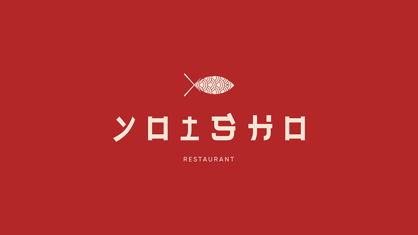
Yoisho is a Japanese restaurant in Ichinocho Hagashi. The name translates roughly as saying of encouragement to yourself or others, you’ll often hear Japanese people say it to themselves before they start work, or you will also hear it when people plop down into a chair or couch after coming home from work. The restaurant was opened by the owner Oishi Akane, who always find the love with Japanese foods.

Inspired by the traditional and popular cuisine of Japan, I came up with the concept of salmon sushi. Japanese culinary always be the delicate of flavor and color, also sushi. It's one of the most popular food over the world, a significant discovery for Japan.
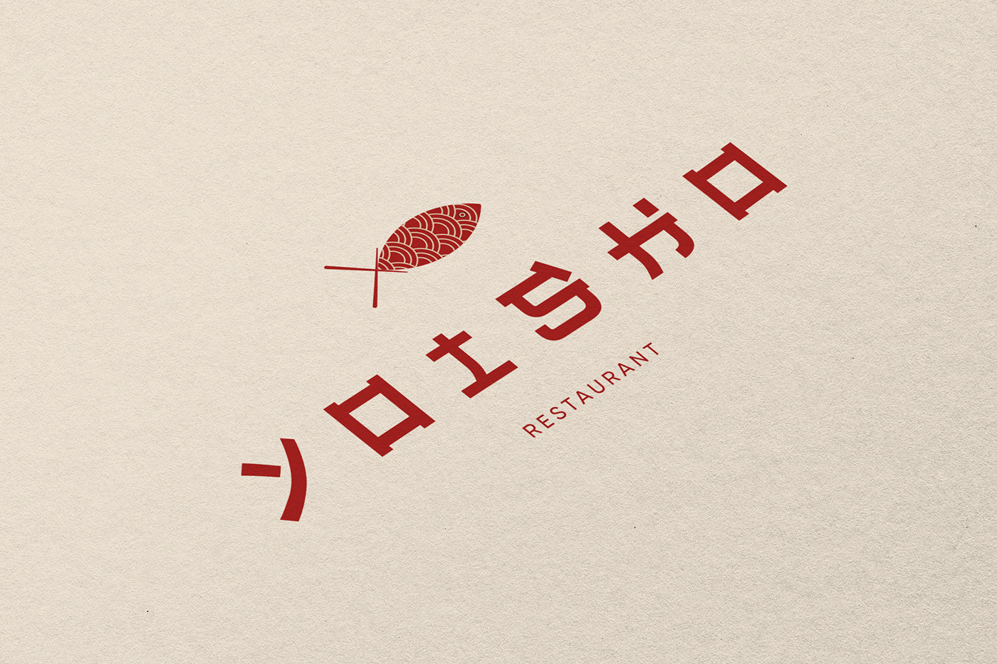
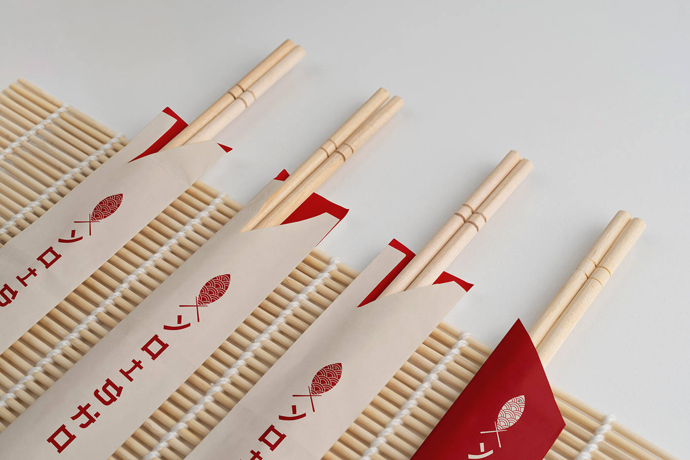
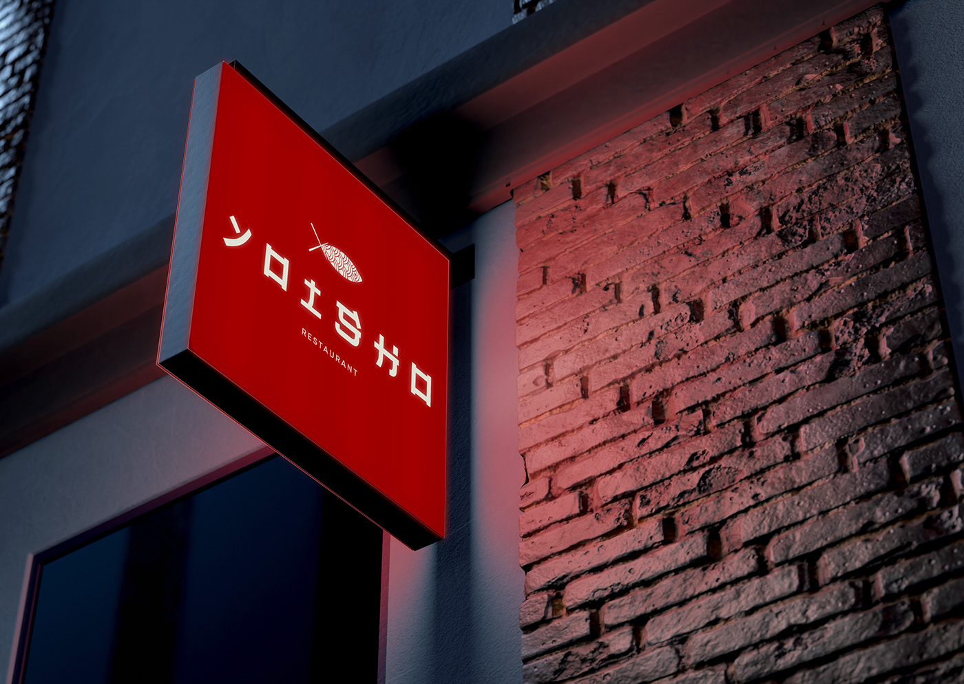
The logo is the combination of a sushi (salmon's eyes), wave pattern (salmon's body), and a chopstick (salmon's tail).
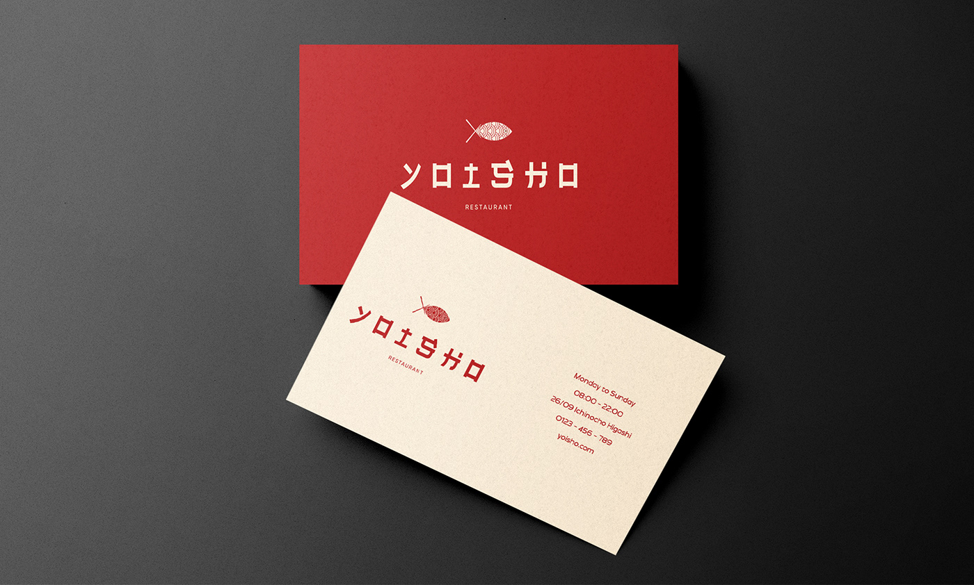
Red and white are prominent traditional colors in Japan. Both colors are used in decorations on foods that represent happiness and joy. Red represents luck, joy, happiness, strength, passion for service on auspicious occasions. Combined with white, symbolizing wealth and prestige, creating a contrast in the design.


Thanks for viewing !


